剛柔流為日本空手道四大流派之一。創始人宮城長順於1915年前往中國福建研究拳法,返回沖繩後持續整合與發展所學,並於1930年將流派命名為「剛柔流」。名稱取自拳譜《武備志》中的「法剛柔吞吐」。如今,其道場及學員遍布世界各地。
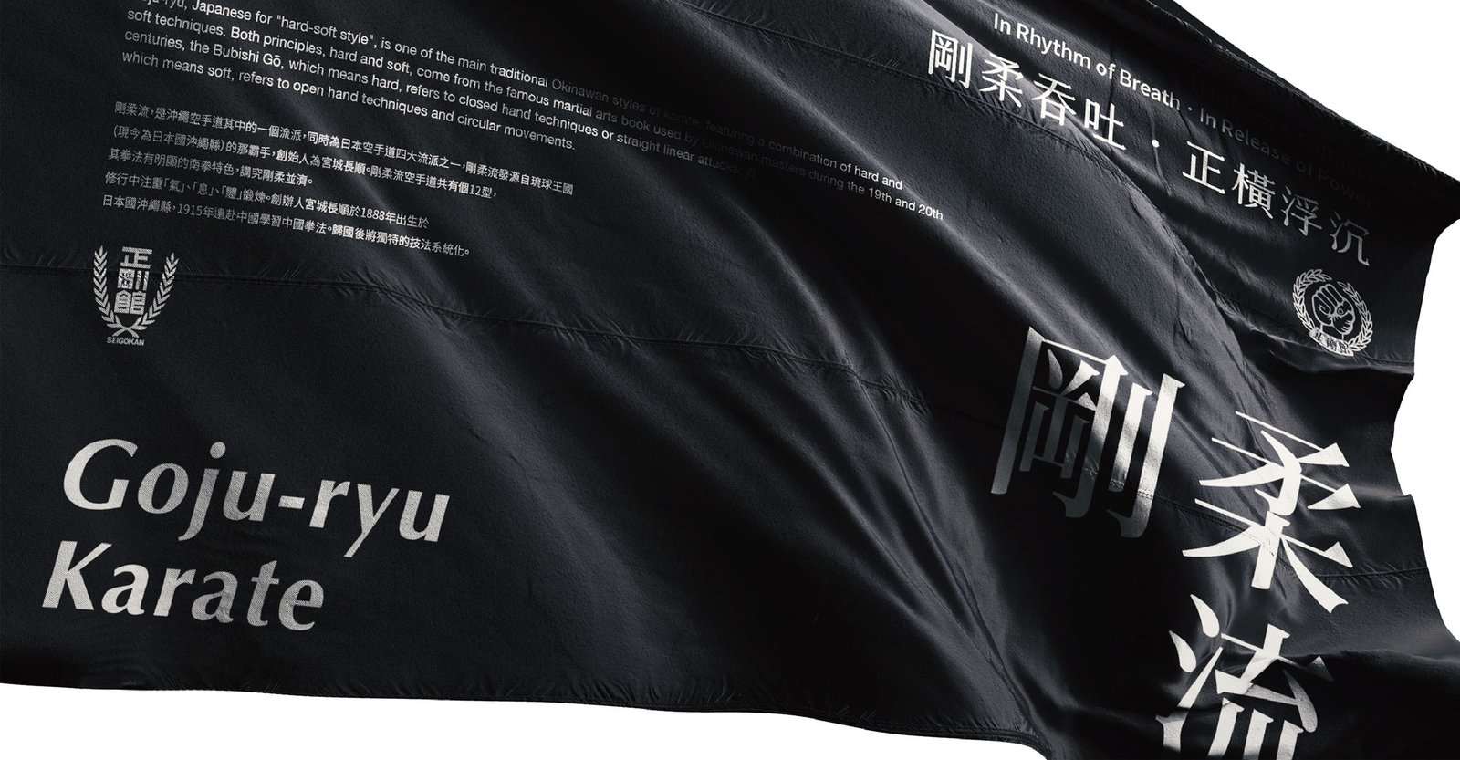
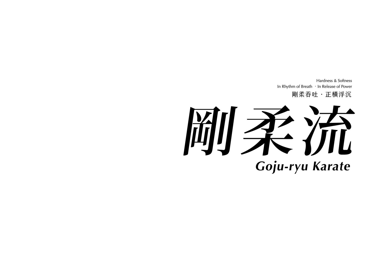
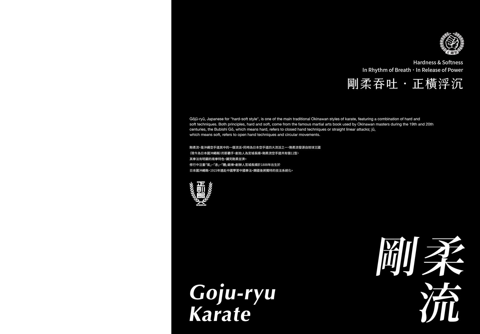
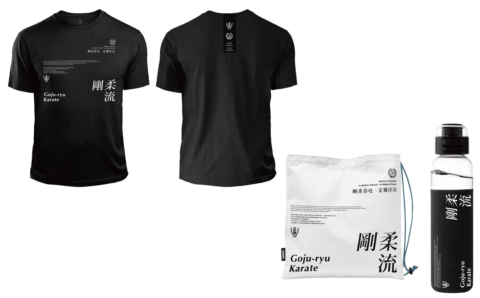
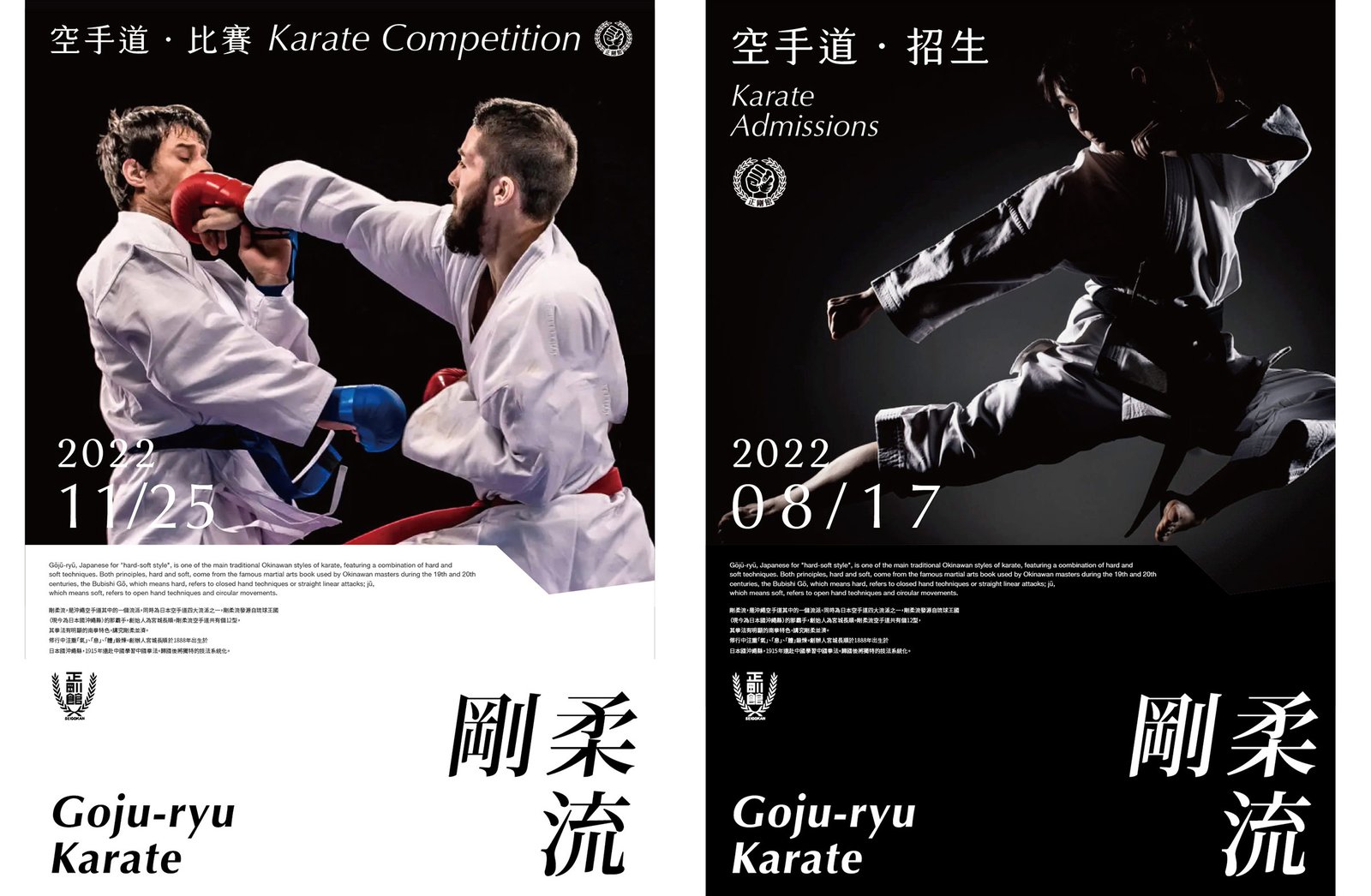
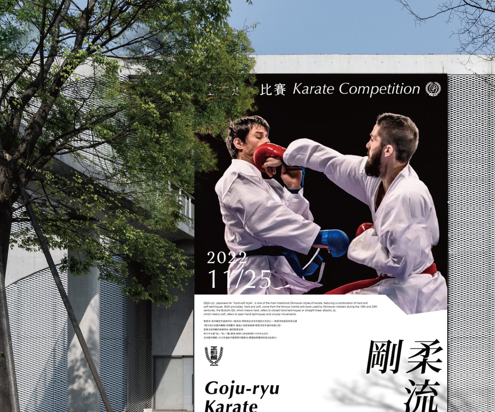
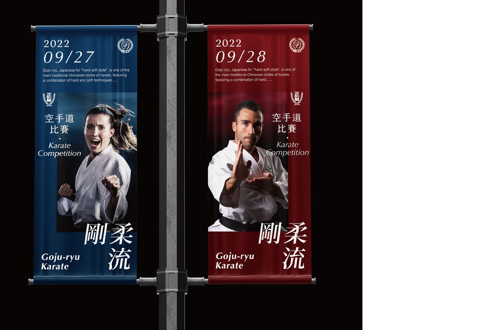
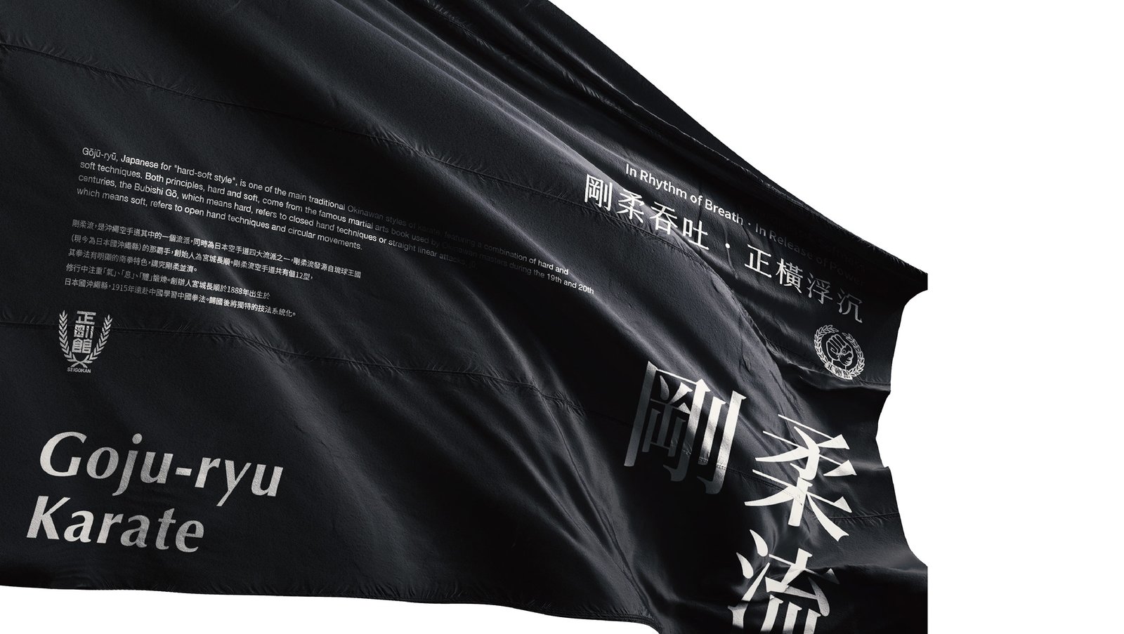
剛柔流擁有悠久歷史。然而,由於年代久遠、分會眾多,各會使用的品牌形象及標誌雖然相近,細節卻不盡一致,亦長期未有更新或修整。為此,我們重新檢視所有品牌元素,考量其歷史、應用範圍及當代審美,在保留原有標誌及核心元素的基礎上,著重調整排版、字體及比例,並將統一的視覺標準應用於相關宣傳物品,令整體品牌形象簡潔有力、時尚而富有速度感,同時保持一致性。
Goju-ryu is one of the four major schools of Japanese karate. Its founder, Miyagi Chojun, traveled to Fujian, China, in 1915 to study martial arts. After returning to Okinawa, he continued to integrate and develop what he had learned, naming the style Goju-ryu in 1930. The name, meaning ‘hard-soft style,’ comes from a passage in the martial arts text Bubishi that links hardness and softness with inhalation and exhalation. Today, Goju-ryu has dojos and practitioners around the world.
Over its long history, Goju-ryu’s identity had become fragmented, with numerous branches using similar but inconsistent logos and branding that had long remained unrefined. In this rebranding, we reviewed all brand elements, considering the style’s heritage, widespread use, and contemporary aesthetics. Our approach preserves the original emblem and core elements while refining the typography, layout, and proportions. By unifying these visual standards and applying them across promotional materials, the identity achieves a clean, dynamic, and cohesive look that reflects both tradition and modernity.




瀏覽更多作品