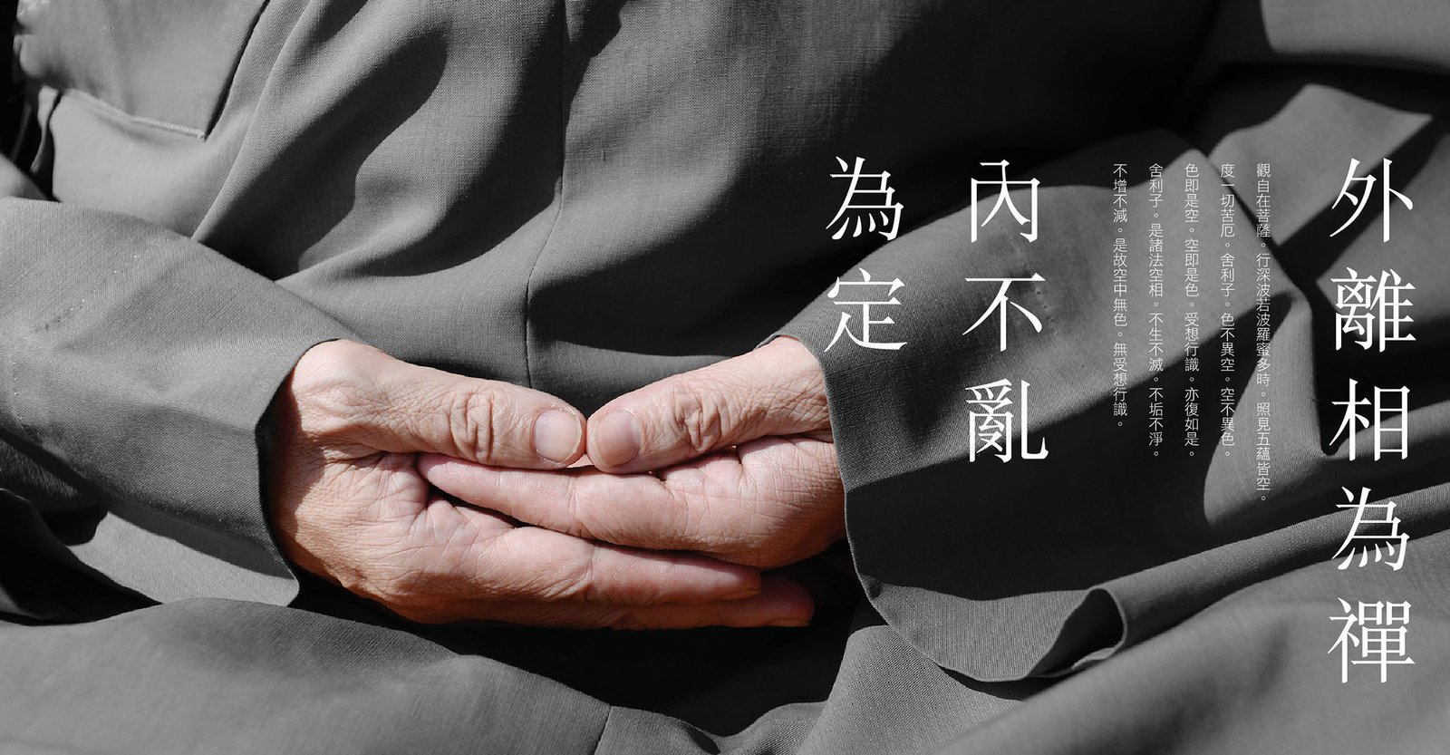
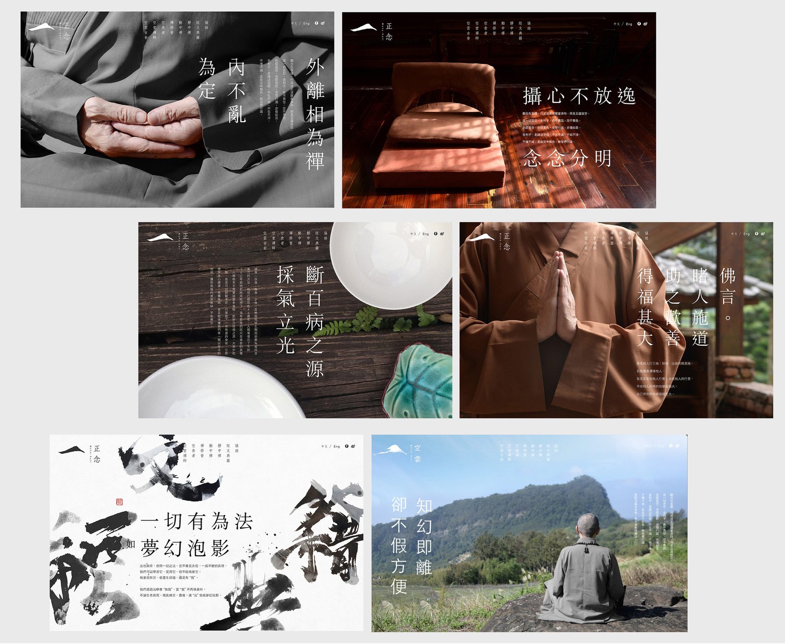
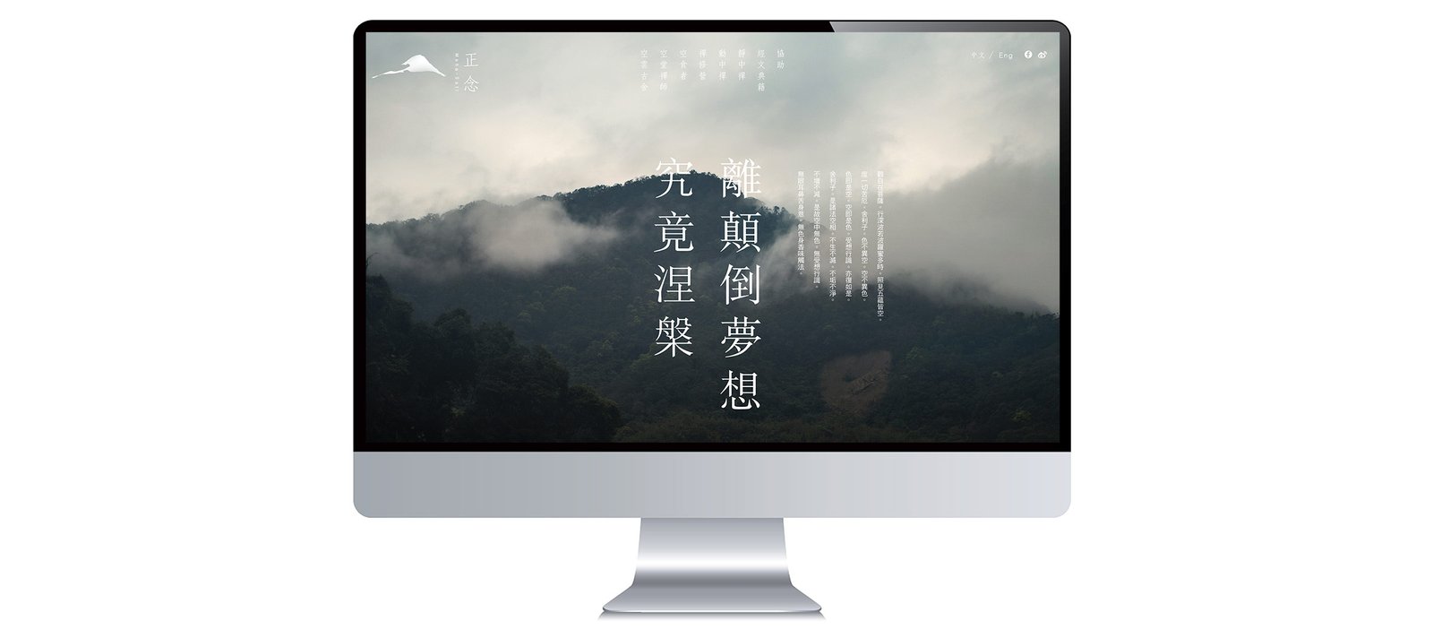
除了商業作品,我們亦經常為非牟利組織進行形象規劃。2016年設計團隊特意前往位於新北市三峽區深山中的空雲古舍,向空堂禪師討教佛法和禪修,在實踐中領悟佛理並將其融合於設計內。
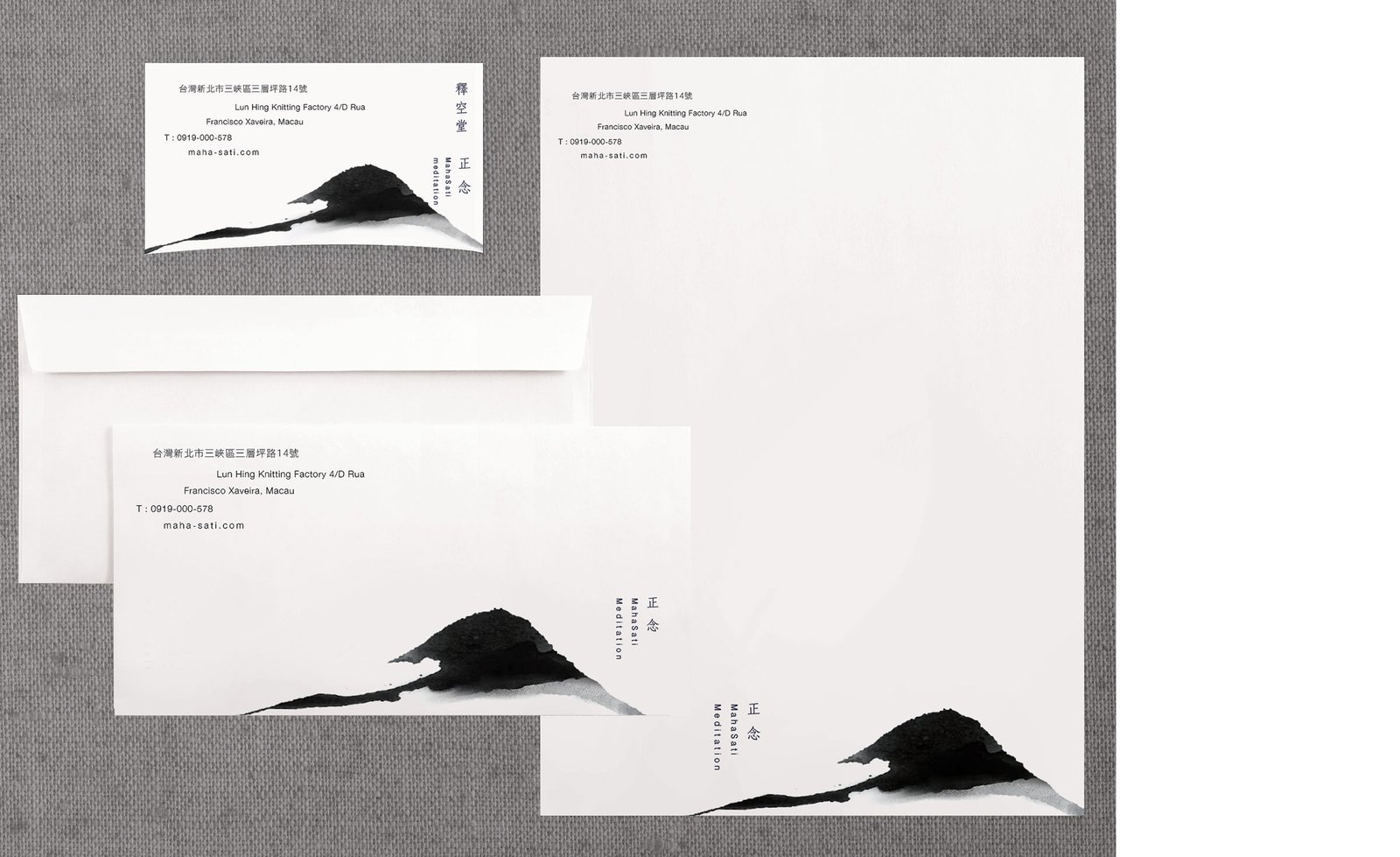
見山是山,見山不是山,見山還是山...佛學裏有很多意義深遠的詞句,同時亦令很多人過於執迷於研究經文典籍卻缺乏實際修行,標誌設計以水墨技法描繪山的形象,當中並沒有艱深的意念,只期望佛弟子上山修行,從中領悟佛理。
Alongside our commercial work, we often develop visual identities for non-profit organizations. In 2016, our design team visited Kongyun Hermitage, nestled in the mountains of Sanxia District, New Taipei City, to learn about Buddhist teachings and meditation from Master Kong Tang. Through this experience, we sought to bring the spirit of practice and reflection into the design.
A well-known Zen saying describes seeing mountains as mountains, then not as mountains, and finally as mountains once more. Its layers of meaning remind us that understanding comes through experience, not merely the study of scripture. For the logo, we depicted a mountain in expressive ink-brush strokes, keeping the visual language simple and direct. The aim was to encourage practitioners to return to the mountains, practice meditation, and discover the teachings for themselves.



瀏覽更多作品